As of last week, Google appears to be testing a new layout for mobile search results. Search is obviously something that Google is very thoughtful of when it comes to design. Even seemingly tiny changes can cause a big impact on user experience and engagements, so Google is careful about how design tweaks are implemented.
Rather than show results in the normal lineup, they are playing with a new mobile search layout that puts each result on its own “card”, bordered on the bottom by a line colored to match Google’s four primary colors – blue, green, yellow, and red.
[Tweet “Google testing a new mobile layout with each result in it’s own “card” [SCREENSHOTS]”]
Looks a lot like Google Now “cards” to us. Cards have been a very successful component in Google search on mobile lately, it will be interesting to see if that’s the road they choose to explore for mobile search also.
I like the new layout, very clean and will put a huge emphasis on your page titles and descriptions as they appear to stand out even more now.
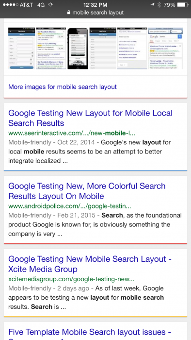
See our screenshots below on iPhone 6Plus using Safari to search for “plumbers denver” –
What do you think of this new “test” layout?


Update – March 4, 2015 – Haven’t seen the test layout again for a few days, but spotted it again this morning. Here is a screenshot of this post in mobile results, in the mobile search layout.